Brief
Create a compelling second screen AR experience for kids watching Nickelodeon Kids’ Choice Sports.
Approach
We designed and built the Augmented Reality portion of Screens Up which involved the teams designing the games and interactions, mapping out the UX journeys, creating concept art, building 2D/3D assets and motion graphics, designing the app architecture and finally writing the code that ties everything together.
Impact
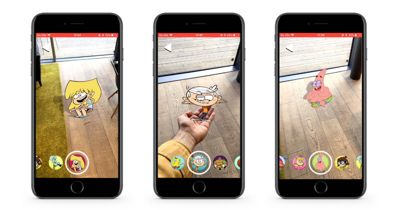
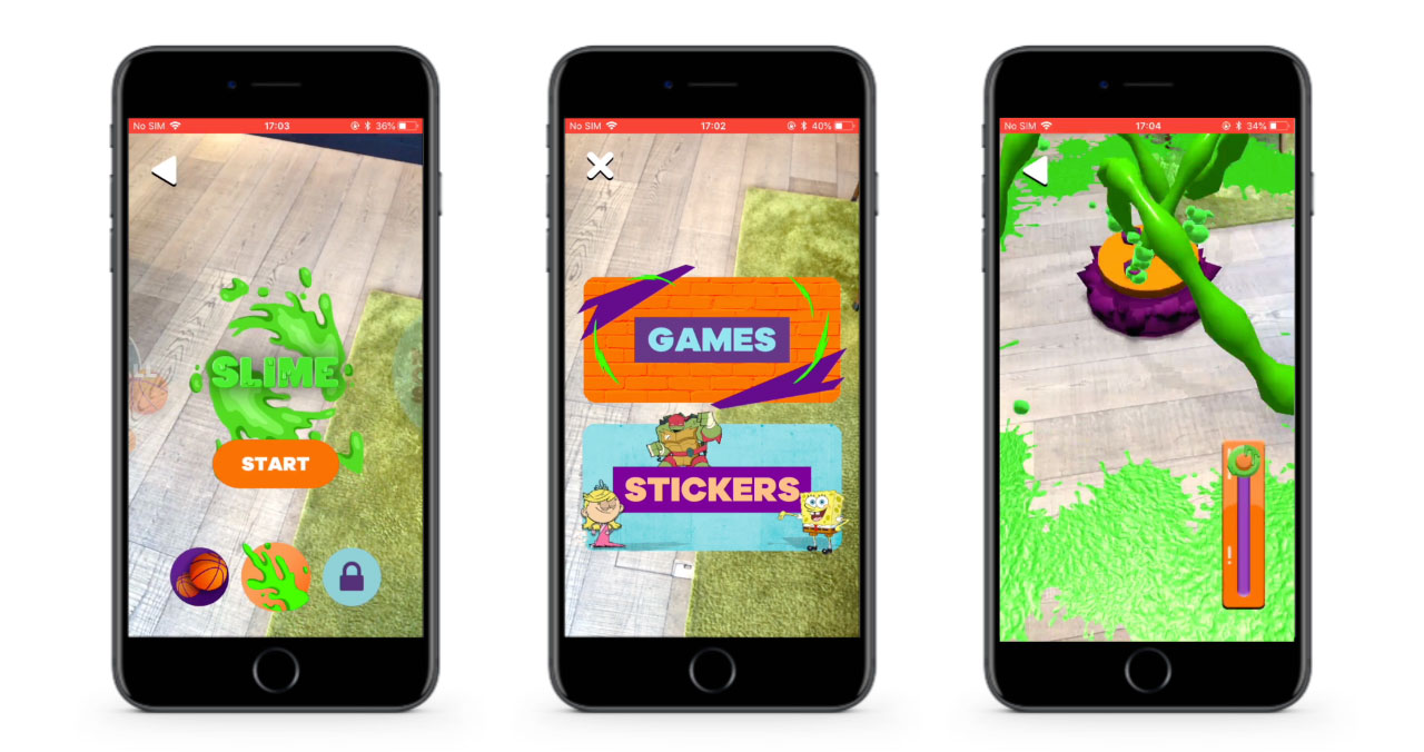
Augmented Reality mobile app containing several AR mini games, AR stickers and lots of slime!


Mill+’s Creative Technology team explains ‘There were many considerations to be made within this project due to the target demographic of a young user base combined with a quick turn-around.
It was important that this app ran smoothly on lower end devices, taking into consideration that the younger user base typically engage with handed down technologies.
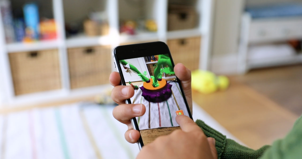
Additionally, the young demographic shaped the entire UX, not just in terms of traditional considerations regarding on-screen elements, but the physical practicalities of small hands on devices of varying size and weight.
The app had to be out in time for Nickelodeon’s Kids Choice Sports Awards since it was the ideal opportunity to showcase this modern take on second screen content and Augmented Reality.
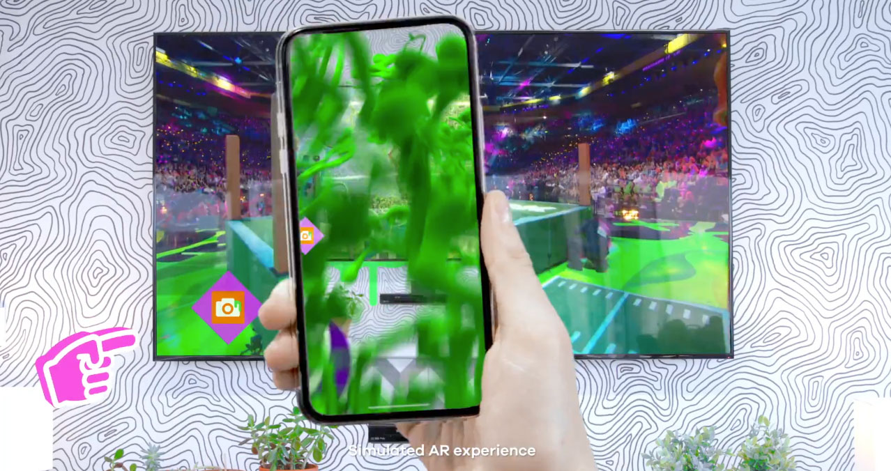
Screens Up aims to solve the conundrum of engaging second screen content for live TV using Augmented Reality. Additionally, we wanted to ensure that the app could continue to be engaging outside of the live TV show. To tackle this, we created evergreen content that players can enjoy at any time, unlocked by the live TV.
We utilised bridging code to streamline communications and collaboration between the different tech-partners. This allowed all parties to work independently for longer periods which really helped meet the tight deadline.
We were also able to bring in artists of different disciplines from all across The Mill to experiment with different approaches. We had 3D artists running fluid simulations, motion graphics artists creating particle effects and animations and creative coders combining realtime mesh construction with shaders.
Experimenting with new approaches is a vital part of what we do at The Mill and we’re glad we were able to leverage our pool of artists in so many ways during the production of this app.’
